class 8
LAYOUTS
key concepts in positioning elements
-
Building Blocks: CSS treats each HTML element as if it is in its own box. This box will either be a block-level box or an inline box.
-
containing Elements: If one block-level element sits inside another block-level element then the outer box is known as the containing or parent element.
Controlling the position of elements
CSS has the following positioning schemes that allow you to control the layout of a page: normal flow, relative positioning, and absolute positioning. You specify the positioning scheme using the position property in CSS. You can also float elements using the float property. To indicate where a box should be positioned, you may also need to use box offset properties to tell the browser how far from the top or bottom and left or right it should be placed.
- normal flow
position:static - relative positiotning
position:relative - absolute positioning
position:absolute - fixed positioning
position:fixed - floating elements
float
and much more.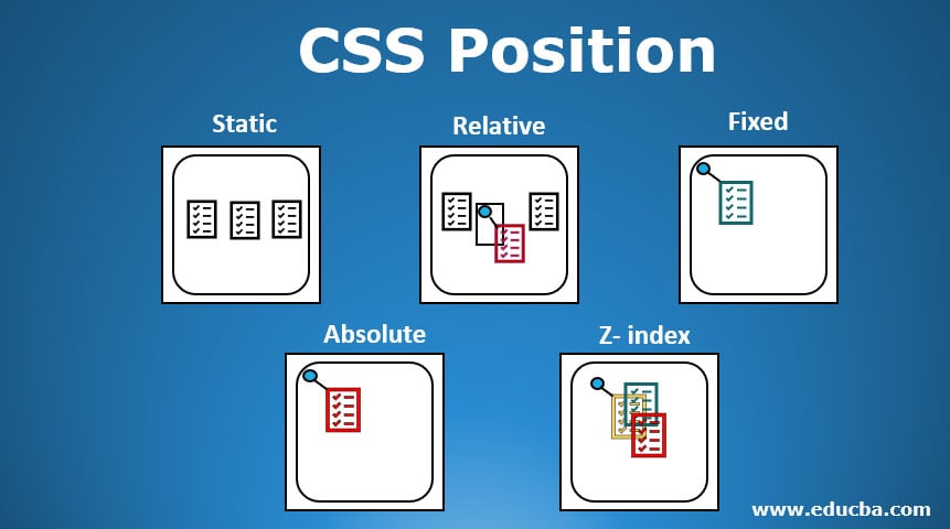
screen sizes
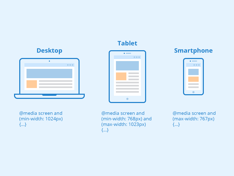
Different visitors to your site will have different sized screens that show different amounts of information, so your design needs to be able to work on a range of different sized screens.
screen resolution
Resolution refers to the number of dots a screen shows per inch. Some devices have a higher resolution than desktop computers and most operating systems allow users to adjust the resolution of their screens.
page sizes
Because screen sizes and display resolutions vary so much, web designers often try to create pages of around 960-1000 pixels wide (since most users will be able to see designs this wide on their screens).
<div>elements are often used as containing elements to group together sections of a page.- Browsers display pages in normal flow unless you specify relative, absolute, or fixed positioning.
- The float property moves content to the left or right of the page and can be used to create multi-column layouts. (Floated items require a defined width.)
- Pages can be fixed width or liquid (stretchy) layouts.
- Designers keep pages within 960-1000 pixels wide, and indicate what the site is about within the top 600 pixels (to demonstrate its relevance without scrolling).
- Grids help create professional and flexible designs. X CSS Frameworks provide rules for common tasks. X You can include multiple CSS files in one page.